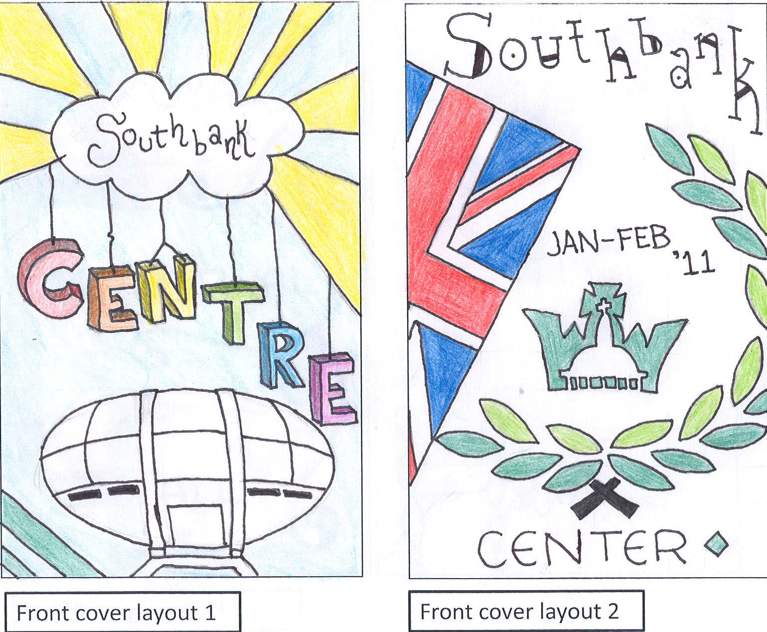
These are my drafts for the front cover of my Southbank Center leaflet. As you can see by my final piece, the design I went with was the left one because I thought it was more catchy and less confusing. The writing is so clear along with the typography and colours that it can also attract a variety of audiences and not just one.

These drafts are 2 ideas for the left hand side of the middle pages. Looking at my final piece, I can see that I haven't gone with any of these ideas for my middle pages.

I then came to the right hand side of the middle pages. This is where all the information is going to go depending on what I chose to do it on. I also didn't seem to go with any of these designs either.

I didn't get to finish this back cover draft but I did get a rough idea from it of how I would like my actually back cover to look like. When I look at my back cover, I realise that the draft I got my ideas from is the left hand side one.
LOG: Overall I think my drafts did help me but they could of helped me a lot more. I feel I could of added much more detail into them so that when it came to the final piece, I didn't have to work as hard. All in all, I do think that my drafts were acceptable because they helped me with the bits that I didn't end up focusing much on.
No comments:
Post a Comment