To research the range and types of creative and media things in the Southbank, we used sources such as the internet and also transport so that we could literally go down to the Southbank and find out information for ourselves whether that being by having talks, looking around, picking up leaflets etc.
During this unit, whilst we were at the Southbank, we took a trip to the IMAX cinema and watched a 3D film so that we could have something to discuss about when we came across the sector of 'Film'.
Throughout this project I had a lot of strengths and weaknesses. I was very strong with using my creativity on my leaflet that I produced and also strong at researching with different ideas and sources (finding out information). But, on the other hand, I was slightly weak at staying commited to my blogger and keeping up to date as I had problems using blogger with my laptop at home.
I feel that I could of made quite a few improvements within this unit such as getting more written down and updating my blogger much more often than I initially did. Also, I think I could of followed instructions more carefully, sufficiently and quickly so that towards the end (by the deadline) I didn't have to rush.
I think, overall, I have done my work to an acceptable standard. I think with the amount of work I have produced, I could be able to gain a reasonable grade.
Monday, 23 May 2011
Sunday, 22 May 2011
1.4 Draft for the guide to the Creative and Media Scene in The Southbank.
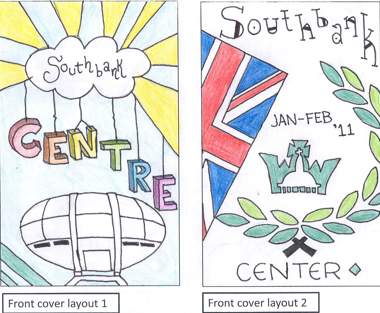
These are my drafts for the front cover of my Southbank Center leaflet. As you can see by my final piece, the design I went with was the left one because I thought it was more catchy and less confusing. The writing is so clear along with the typography and colours that it can also attract a variety of audiences and not just one.

These drafts are 2 ideas for the left hand side of the middle pages. Looking at my final piece, I can see that I haven't gone with any of these ideas for my middle pages.

I then came to the right hand side of the middle pages. This is where all the information is going to go depending on what I chose to do it on. I also didn't seem to go with any of these designs either.

I didn't get to finish this back cover draft but I did get a rough idea from it of how I would like my actually back cover to look like. When I look at my back cover, I realise that the draft I got my ideas from is the left hand side one.
LOG: Overall I think my drafts did help me but they could of helped me a lot more. I feel I could of added much more detail into them so that when it came to the final piece, I didn't have to work as hard. All in all, I do think that my drafts were acceptable because they helped me with the bits that I didn't end up focusing much on.
Friday, 20 May 2011
1.4 Drafts of a guide to the creative and media scene in the Southbank.

This guide is double sided like my final piece. It has a good colour scheme because the black background makes the light coloured pictures stand out. It looks very dynamic the way the owl looks like it is coming out at you on the front cover (like the films at the actual IMAX cinema when you have your 3D galsses on).

This leaflet is from the southbank along with the others that have been scanned onto this page. This leaflet didn't really inspire me like the others as I was planning to do an information booklet. The colour scheme on the other hand looks really good because the background is dark (black) which makes the green headings and white text stand out. Also, having the writing overlay the pictures makes the leaflet look very modern.
 The yellow double sided is the front cover of the information booklet advertising details of upcoming shows that are taking place at southbank. I like the way it has a yellow background because it makes it bright and very eye catching for the readers. Having the bright blue image of the fist and the top of the guitar over the birght yellow background is very eye catching.
This white double sided is the inside of the booklet. I like the fact that the person who made it kept it plain due to the fact that there was already alot happening on the front/back cover. In my own opinion, I think that if this double sided bit of the booklet wasnt kept plain then it would back the booklet over done because of the fact there is already so much happening on the front and back cover.
LOG: Out of all of the leaflets above, I see that the last leaflet (the one with the yellow front and back cover and white double sides inside) is the most eye catching which means that I think it could attract a much more wider range of an audience. I think that I could have made myself be inspired by these leaflets so that it could make the whole task be a lot easier.
Subscribe to:
Comments (Atom)