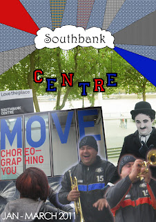
I chose my front cover to look like a slight collage instead of just plain words and pictures. I took all the pictures myself and used photoshop to edit some of the colours. I had trouble with the top bit (the bit that has the different colours and patterns) because I wasn't planning to use those patterns in the first place. They were going to be just plain colours.

Above is my favourite part thats in my whole leaflet due to the fact it looks like "top quality". Again i took all the pictures myself at Southbank and edited them all on Adobe Photoshop except for the images on the right hand page (the sillouette of the guitarist and drummer) which I had gathered from google and just blanked the people out by editing them on Adobe Photoshop. On the Southbank Centre sign (left hand side), I made the picture go in greyscale (and also crossed out the other venues in red) except for the sign that said 'Royal festival Hall' so that the readers realise quicker what the main focus of my leaflet is.

This is how my back cover turned out. I was not expecting it to but I have seemed to realise that my drafts slightly went to plan (only a little bit). Again, I took all the pictures on my own when my class and I went on the trip to the Southbank Centre. The only picture that I didn't take is the one of the map in the bottom right hand corner. I got that picture from the internet (Google) but then edited it on Adobe Photoshop so that it looked as though it was my own and not copied.
LOG: Overall I think my leaflet was very successful and I don't think I would personally change any of the designs on the final outcome. My drafts came in handy at some points throughout the making but they wern't really as inspiring as they could of been.
No comments:
Post a Comment